Accidental Art
For the past couple weeks, I’ve been playing my way toward a tool that converts pencil sketches to clean line art. The tool remains forthcoming. But here are a few of my most visually pleasing mess-ups along the way:
1. Shadow Grid
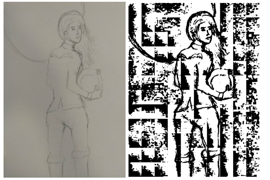
Left: Original image. Right: “Shadow grid” image.
When I first looked at my input images, I wondered if I could find a threshold - some value such that all pixels lighter than it belonged to the background, and all pixels darker than it belonged to pencil strokes. I knew the presence of a shadow on my page would complicate this: “background” pixels under the shadow were as dark as “pencil stroke” pixels in other parts of the image. No problem, I thought - I would just split the image into squares and apply a different threshold in each square. That way, every pixel had a fighting chance at being “seen.”
My mistake was using the average luminance in the square as the threshold. This meant that in each square, roughly half the pixels ended up black, and half ended up white - even if the square was actually entirely “background.” Which was not exactly effective shadow removal, but kind of a cool filter!
2. Picassoesque
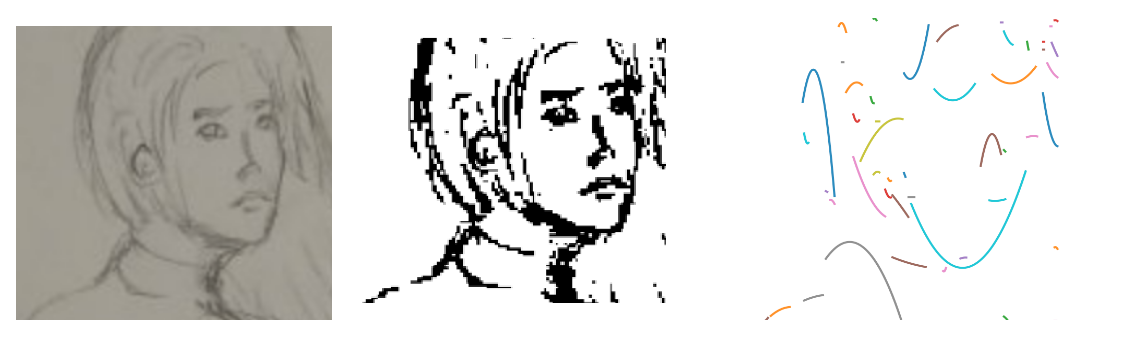
Left: Original image. Center: Thresholded image. Right: “Picassoesque” image.
Further down the line in my explorations, my program was producing thresholded images I was relatively happy with. But I didn’t like that these images maintained their “sketchy” look. Wouldn’t it be nice if I could reduce all that sketchiness into one clean, beautiful, perfect line? Well, I thought, can’t I just think of a black-white image as a set of coordinates for the black pixels? And aren’t there plenty of algorithms for fitting curves to noisy data?
So I wrote a function that crawled through my thresholded image and collected contiguous regions of black pixels. Then, for each chunk of pixels, I projected its (row, column) coordinates onto a graph and used numpy’s polyfit function to fit polynomial curves to the data. The result was way oversimplifying, but… weirdly wonderful?
3. Not A Skeleton
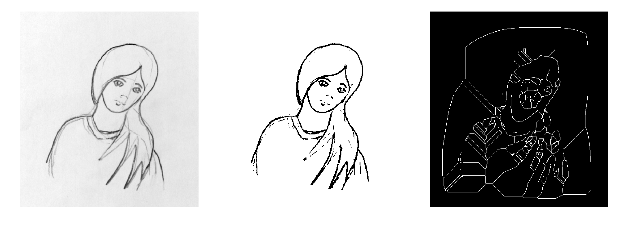
Left: Original image. Center: Thresholded image. Right: “Not a skeleton” image.
This one is frankly horrifying. A fellow Recurser had suggested I look into skeletonization - a technique that would help reduce thick clusters of pixel down to their “skeletons.” Overly excited, I headed right over to scikit-image’s skeleton documentation, declined to read any of it, grabbed the line of example code that seemed most relevant, and ran it.
Oops.
It turns out skeleton looks to find the “skeleton” of the white parts of the image, not the black parts. Which I would have noticed if I’d read the line of sample code that inverted the image before proceeding. But whatever - I now have some exciting new imagery for my nightmares!